A test copy of the newsletter
An example of one of my progress reports
When getting feedback, I would email a test copy of the newsletter to my email, and break down any updates for the client in a progress report.
Pre-header & Header
- Remove ‘Magazines’ heading.
- Try a version of the header with a gap between images and red block.
- Remove ‘Magazines’ heading.
- Try a version of the header with a gap between images and red block.
Upper Body & Columns
- Welcome section too boring, spice up this section!
- Play with branding each newsletter type for: Magazines, Products & Gifts, Prints & Artwork, and Books.
- Optional feature text is obsolete and having the big cover works on its own.
- Try moving this section to the Lower Body.
- Move ‘The Edit’ above the feature.
Lower Body & Footer
- Remove images at the bottom, doesn’t work.
- Moving copyright italics to the bottom.
- Add unsubscribe link placeholder.
- Try 2 columns for the addresses; test how this would work with only three paragraphs as it could get top heavy?
- Remove images at the bottom, doesn’t work.
- Moving copyright italics to the bottom.
- Add unsubscribe link placeholder.
- Try 2 columns for the addresses; test how this would work with only three paragraphs as it could get top heavy?
Some bits I noticed I want to change and add:
- Hex code for the red is wrong, look up 032c Pantone to Hex code.
- Try gap on top at 17.5px.
- Remove the ugly border around the Instagram links.
- Build a subscribe and unsubscribe form (depends on time).
- Hex code for the red is wrong, look up 032c Pantone to Hex code.
- Try gap on top at 17.5px.
- Remove the ugly border around the Instagram links.
- Build a subscribe and unsubscribe form (depends on time).
Pre-header & Header
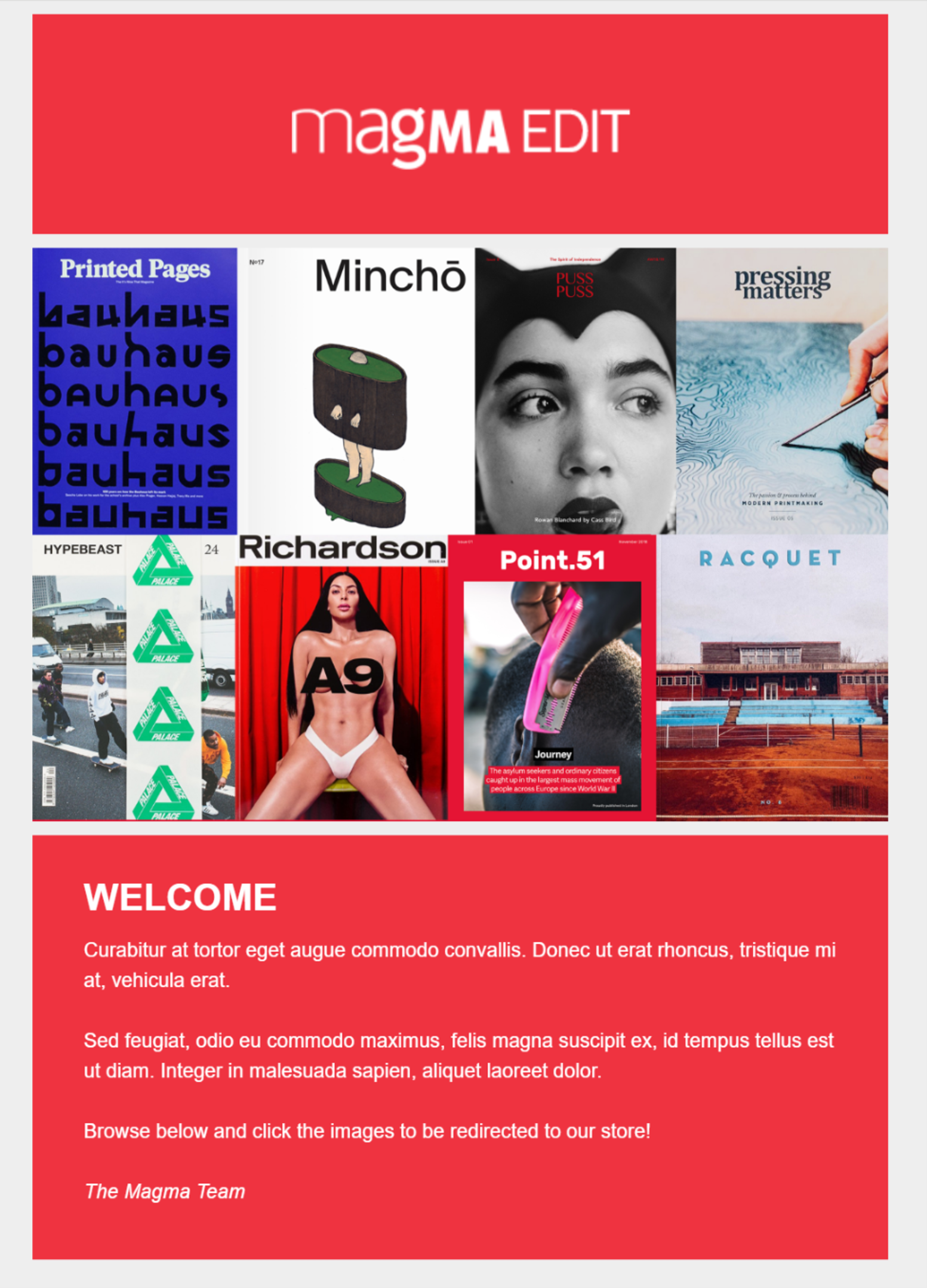
I added the gap as requested, it’s currently at 17.5px (I’ve used spacers at 17.5px, 35px, 70px increments which look good), and I could make it larger if you’d like.
Since the image along the footer is removed, I thought it might be nice to add in the larger header again, to display all the products featured in the newsletter immediately. I’m not sure if it’s too chunky? Did you prefer the three images or this collection?
The ‘welcome’ section has been moved to the Header and it’s in the same hex colour as the Magma red, so these two sections look more unified as an introduction.
The only thing that makes me doubt this choice is, do you think having the white on red text in the smaller paragraph font is too hard to read? I don’t want to force the readers to squint, and I could try a lighter shade of grey if this is too harsh.
Upper Body, Lower Body & Columns
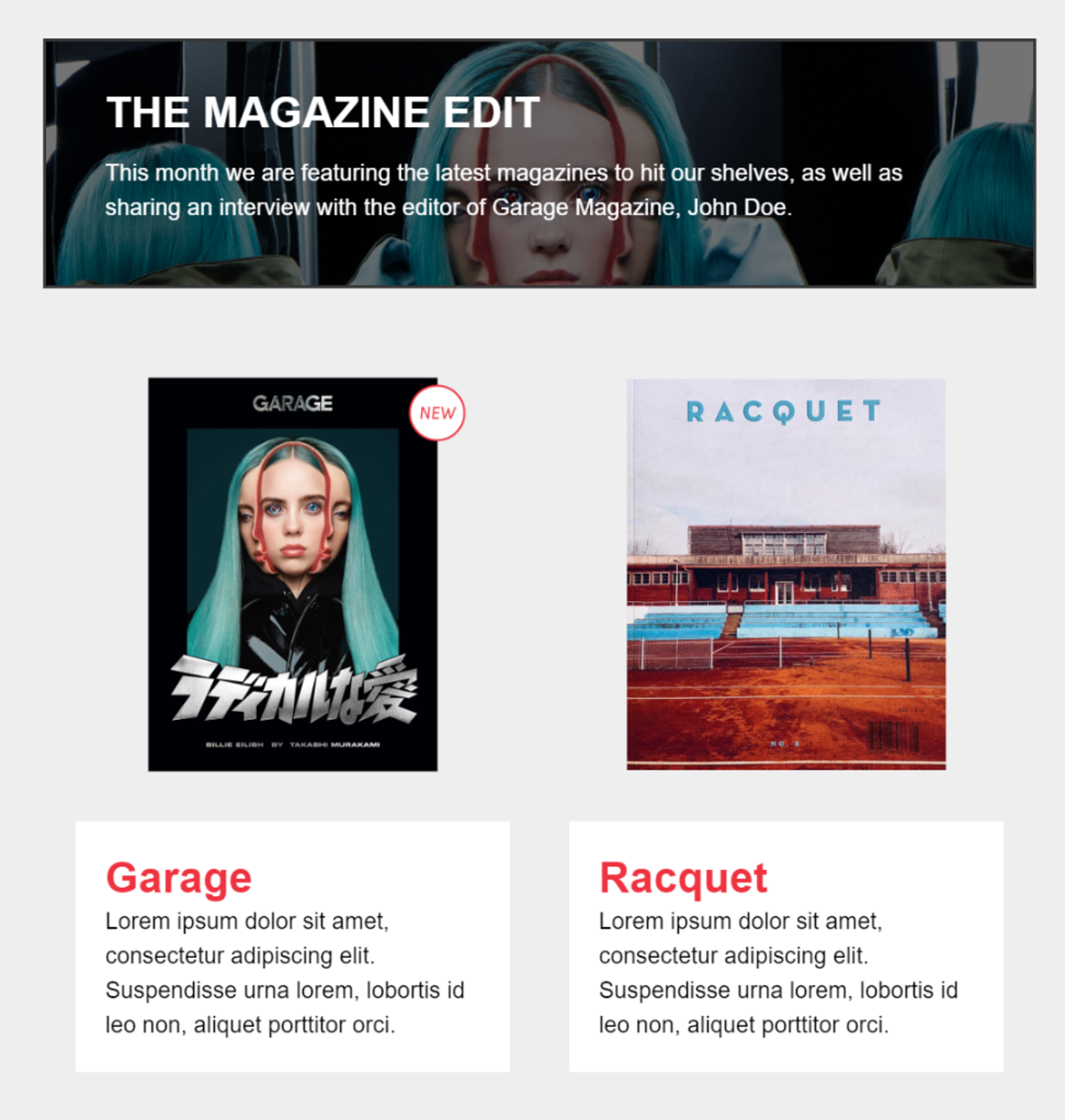
This section had a complete makeover. I was trying many different things to try and brand that this is a ‘Magazine Newsletter’. It was a challenge to work out how each newsletter could look different for the four categories (Products & Gifts, Prints & Artwork, Books, Magazines).
First, I played with the idea of incorporating some of wholesale brochure design choices. The red being ‘Magma’, the other colours representing a different category.
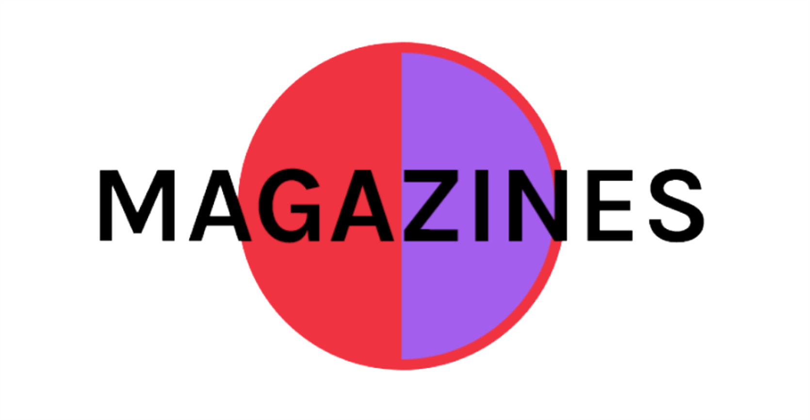
I was planning on trying something like this for the header:
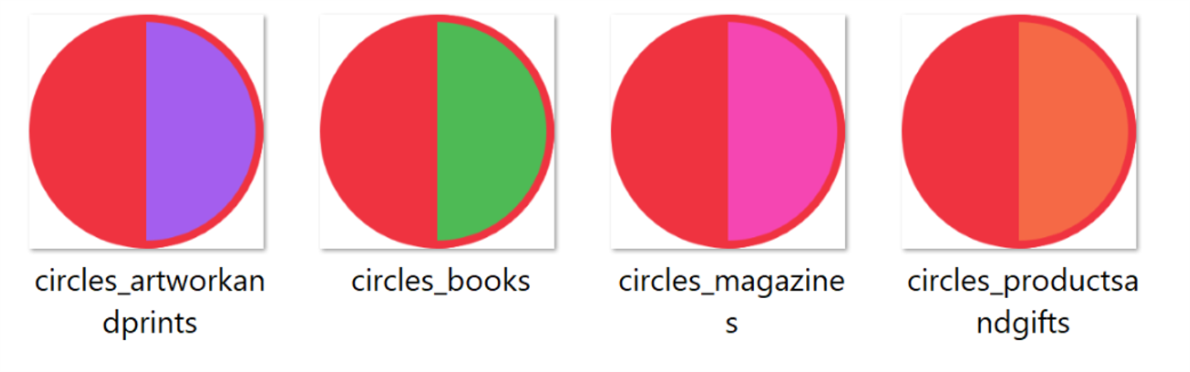
But, I think it looks really untidy because I’m not sure if the graphic relays what I’m trying to say clearly. I was informed that the circle graphic was utilised as they are used on the print tubes. I was unsure if I should continue pushing this look for the newsletter.
I ended up stopping, going back to square one. I believed you’d prefer it if I kept it simple and smart, so I worked with what I had already.
First thing I did was add a ‘New’ sticker on the product image so, despite what theme the newsletter is, the reader knows that, “Oh, this is a new product at Magma!”
I also switched the black headers to the Magma red so it’s less flat and boring.
Back to the header! I tried making it entirely blue, and then the headers blue, and it looked so out of place and not synonymous with the Magma branding just because I’d used so much red. I tried other colours too, yet anything but the #eeeeee grey, the white and black, or #ef3340 red, felt ‘off’.
My result? I lent more towards mimicking a sleek editorial magazine layout.
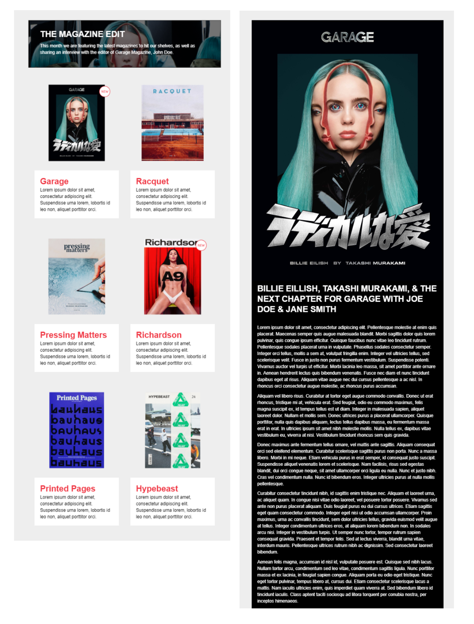
I added a background image to ‘The Edit’ header, in particular an image of the featured product in the Lower Body. In this example, you can see Garage Magazine is featured, so the background image is a page from the issue, the description tells you what the edit includes: the theme which is ‘the latest magazines at Magma’, and the feature, an interview with an editor at Garage.
I think an editorial approach elevates this section, and when you zoom out and look at the Body and Columns, they look pretty synonymous with each other.
Footer
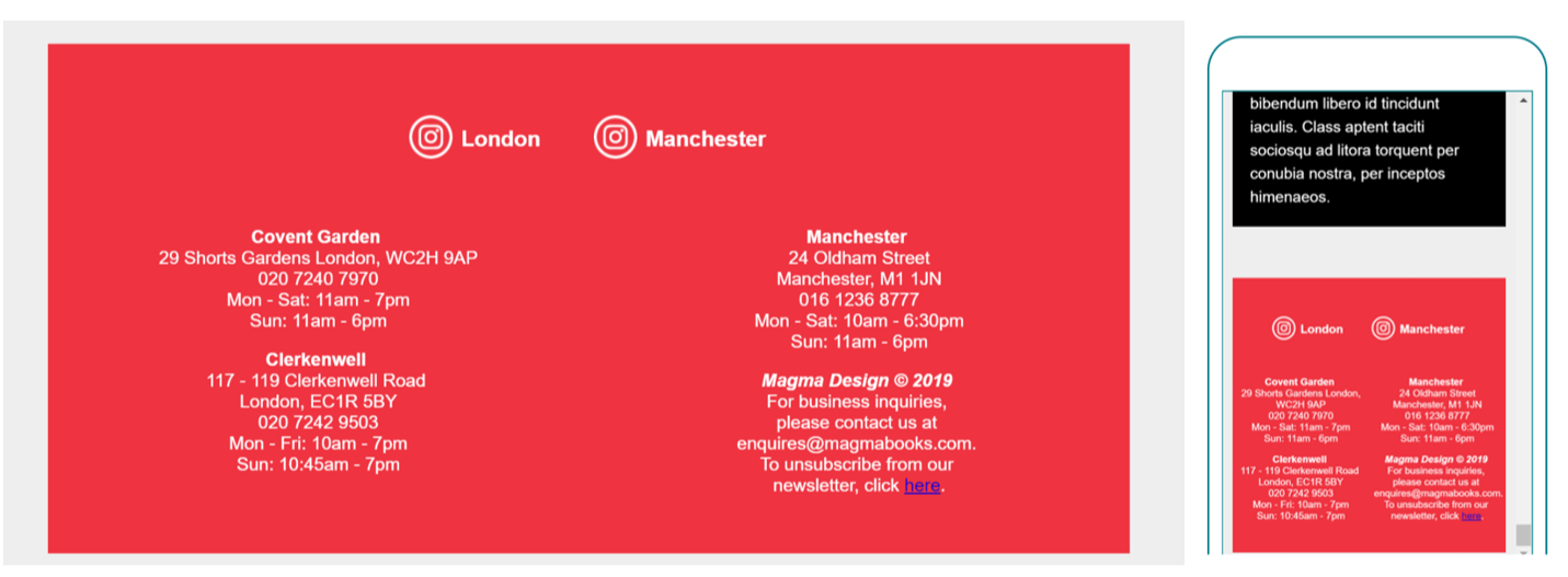
Lastly, the footer! I removed the border around the Instagram icons. I altered the HTML code so the text would be split into the requested two columns.
Getting the footer to be responsive on mobile was difficult due to the columns padding issues, but achievable as seen above. I may try aligning them to the left, as now looking at it, the centred shape is odd?
I have moved the copyright text down; in order to fill the columns so their shape is symmetrical, the copyright is at the bottom right, and not underneath. The unsubscribe text is also added, but the link is a placeholder as it requires a new form to be made.