This is my favourite clip from the E3 2017 trailer for 'The Last Night'.
When we were tasked at university to develop a next gen game environment, it instantly popped to mind.
I love the pixel art style, and was intrigued to learn how it could be done.
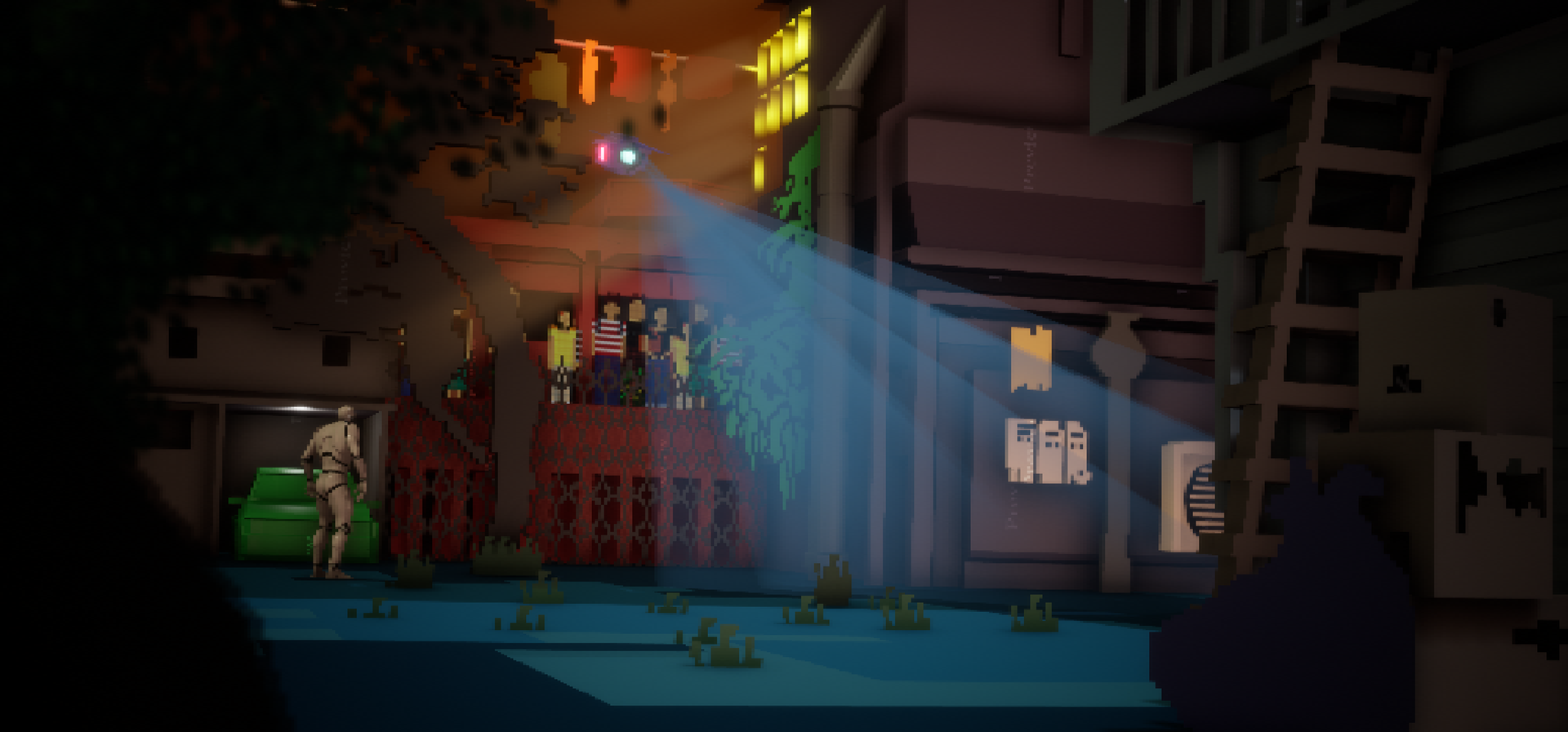
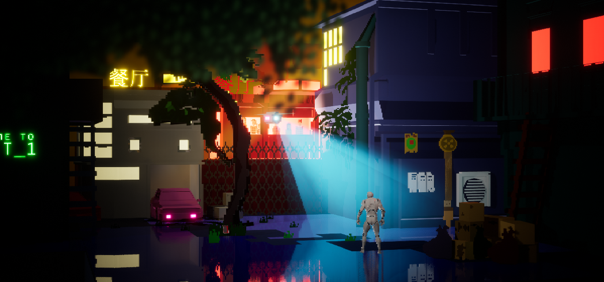
I ended up with two results! The first focuses on being a closer comparison, with its fixed camera angle and matte textures. The second environment ended up not being a recreation at all, as I experimented with adding a shorter focal length, a movable third person character so you can navigate the space, as well as a reflective 'water' shader.
There are elements of both that would improve the other scene, and I would like to revisit this project to create a master scene that combines them. Till then, I think it's interesting to see the separate results.
Art Direction
From the get go, I was aware that even though this was a recreation, I still needed to invest in searching for other external influences. This is so I can strengthen the visual language of the scene, as relying on one image is not enough; therefore, in pre-production, I sourced a wide range of references from film, photography and games.
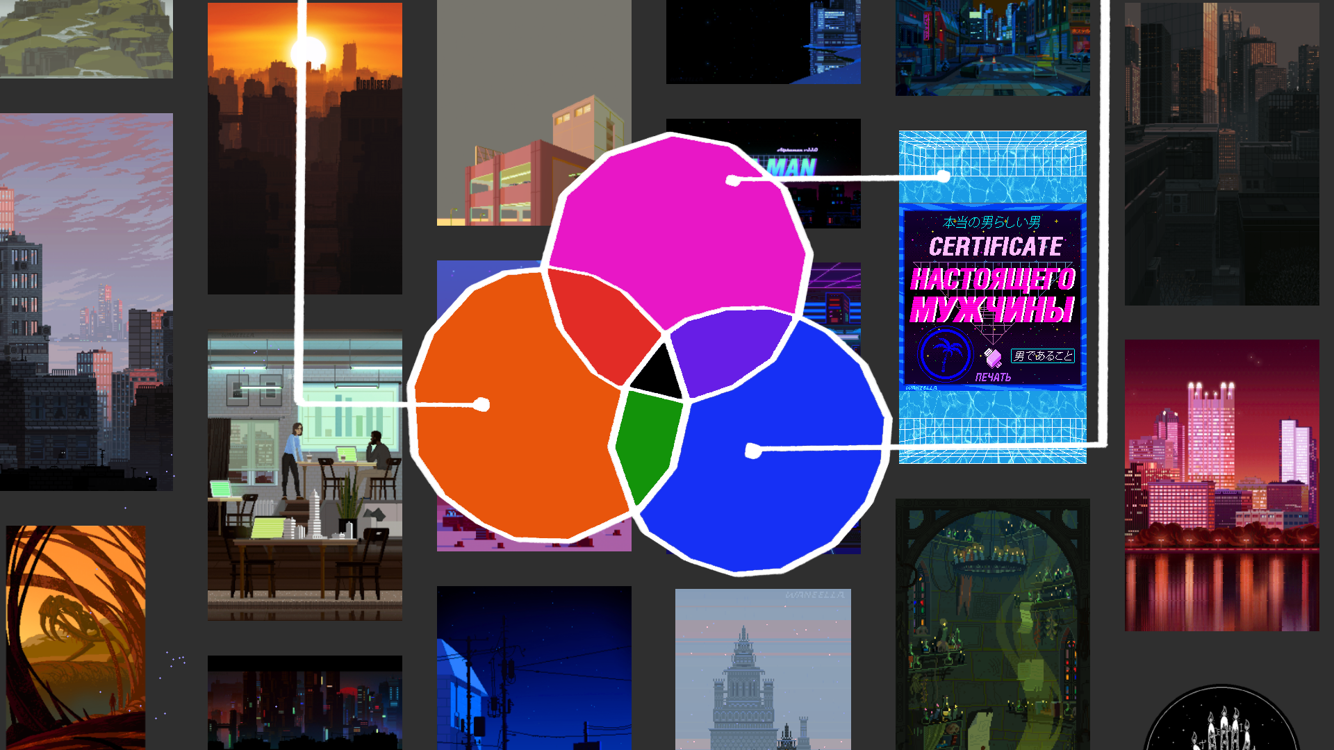
My studies included looking into games like Infamous and Hyper Light Drifter, which have a distinct neon colour palette that's used to guide the player, and photography by Liam Wong, which features diffused lighting and analogous or triad colour schemes.
2D Blockout
My original concept was to place the environment in an arcade machine; I really want to try this still, especially now that I have a better understanding of Unreal and modelling in Maya.
I broke down the scene into zones and created a basic 3D sketch of the layout. This helped me analyse which parts of the scene were foreground, middle-ground and background. Looking into The Last Night's development, you can see they have done something similar, and that it is the camera's focal length that tricks you into seeing a 'flatter', cohesive scene.
3D Blockout
Once I had a simple idea for the scene's design, I moved into Unreal to blockout the space; I struggled with dimensions so I created a couple drafts of the greybox.
With the blockout complete, I revised the zones into six sections. Then, I made notes on the finer, trickier details within each space that I needed to be considerate of if I wanted to truly nail a recreation of The Last Night.
Modelling
Once modelling, I had to consider how the prop would become 'pixelated' in Unreal. I used four different methods for generating a pixel effect; an instance, sprites, textures and models.
Sprites & Textures
To create the sprites, I textured the images in Photoshop and then directly imported them into Unreal, in the place of their blockout models. It was incredibly hard to learn how to make them properly; I had immense trouble with anti-aliasing once the camera got close to the sprite, and the texture would get muddy and blurred.
Firstly, I found that sprites work best when placed far away from the camera, such as the foliage on the pipe in the image below. Secondly, that the colours must be flat and simple; complex blended colours on sprites don't relay well in Unreal - as you can see on the tree up close to the camera in the top image.
Models
Some models were created with exaggerated pixelated features to highlight the art style, such as the electric boxes on the side of the house, the jagged windows in the white house, and the gate below the red restaurant.
Instance
Finally, an instance across the whole scene tied the look together by pixelating the whole scene universally so I could effect the lighting and Unreal mannequin. I'm really proud of this effect; I found a tutorial for how to accomplish this on YouTube and implemented the blueprint myself!
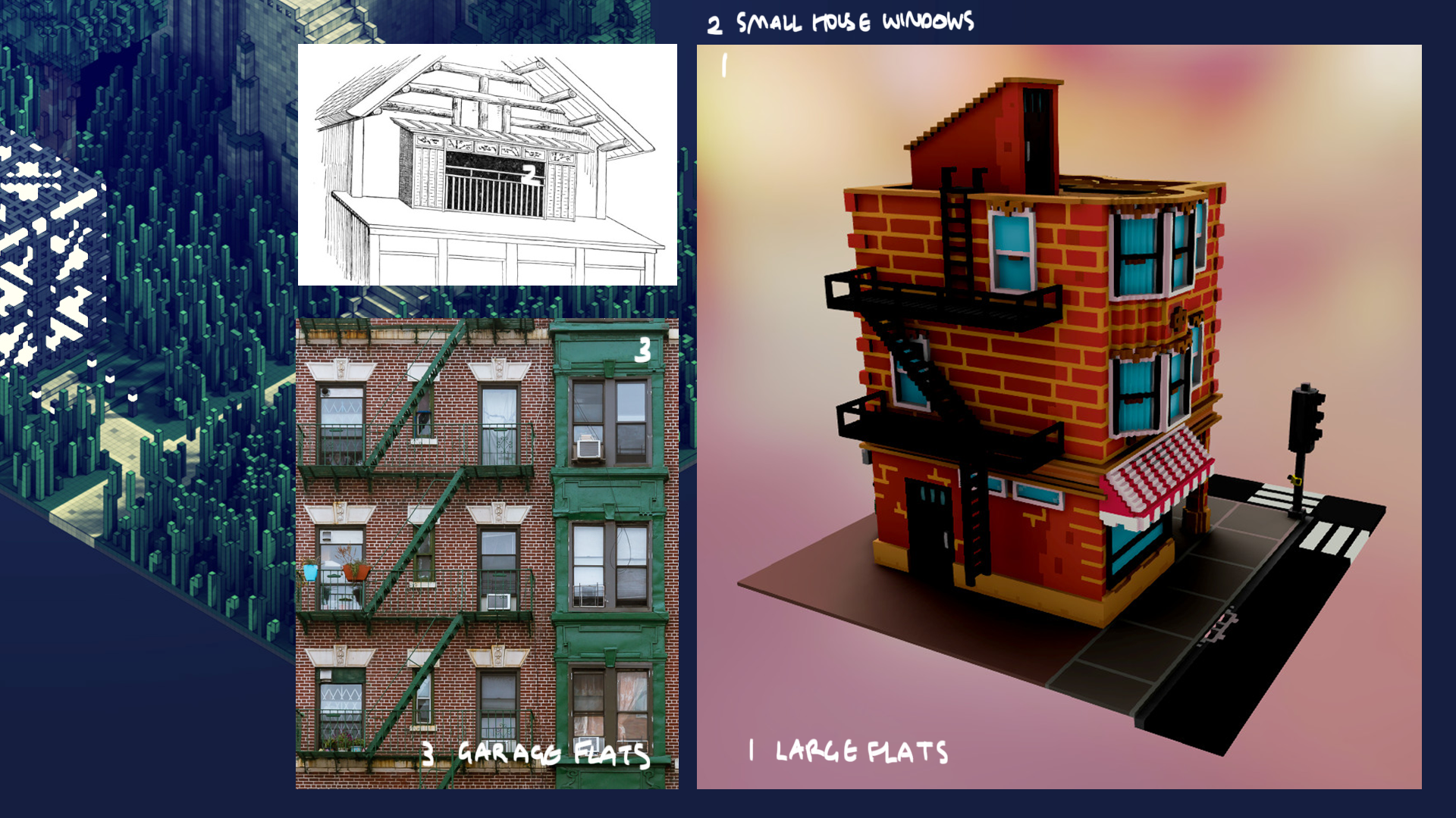
Next, I sourced reference images from low poly artists online to influence how I should approach generating assets; I wanted to make sure that the props I was making had a uniform design and matched the world of The Last Night.
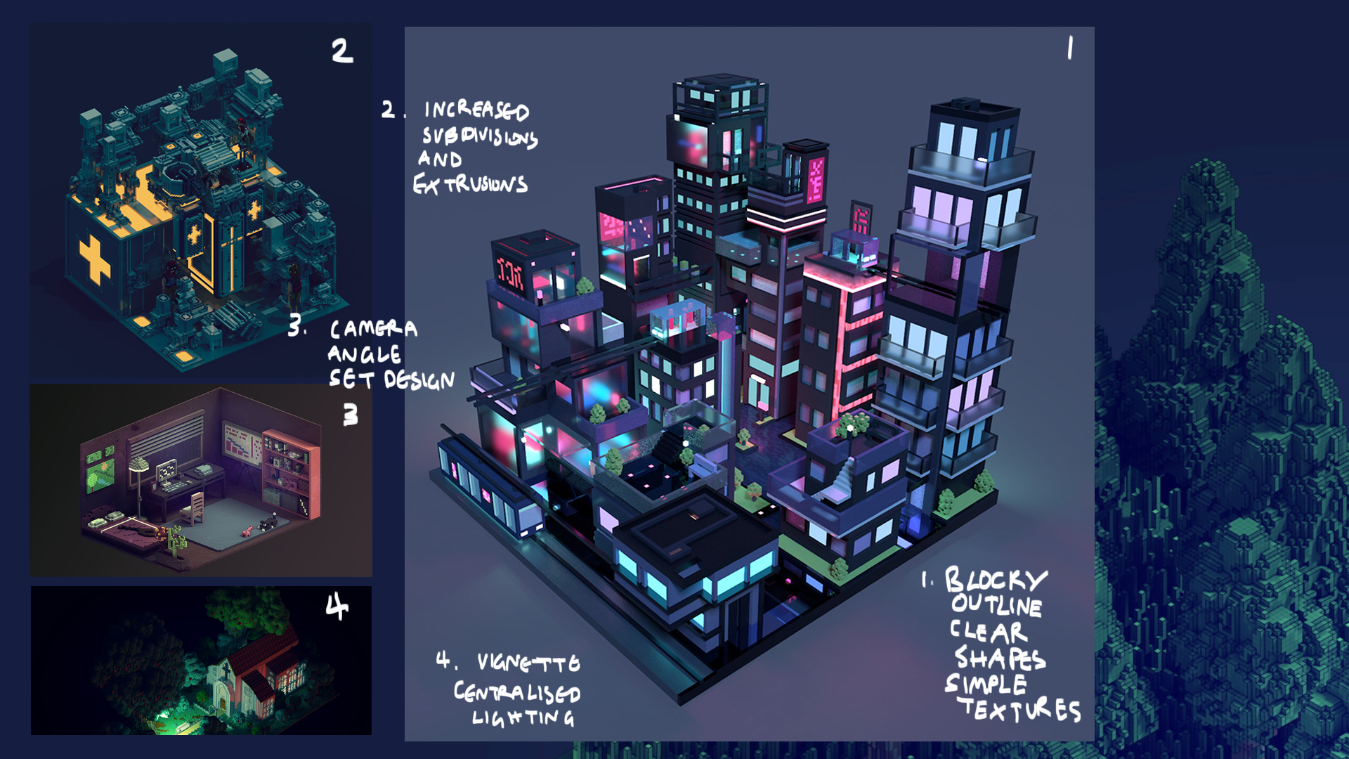

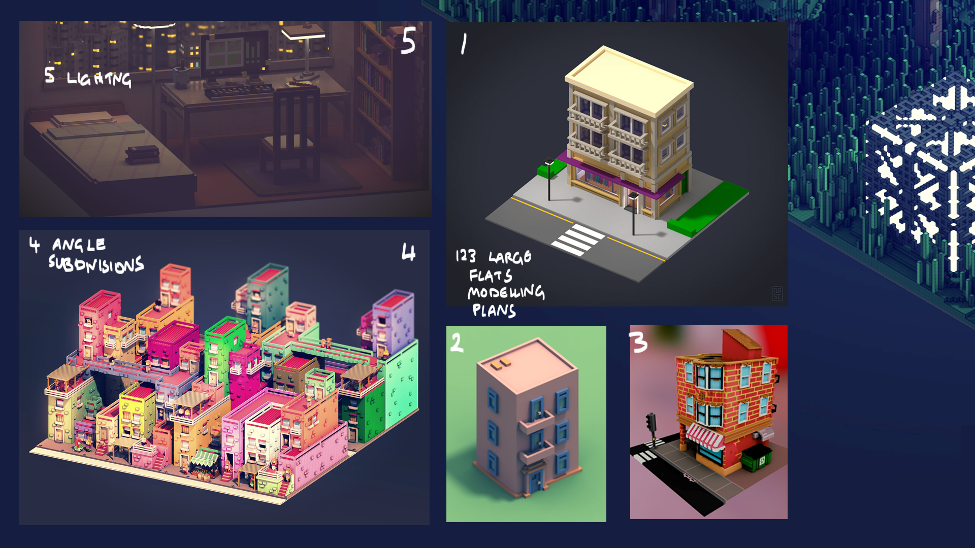
Colour, Shade & Light
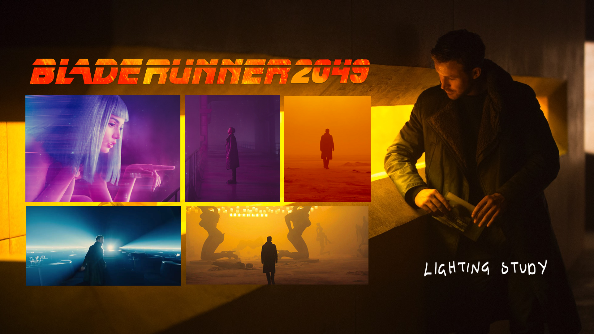
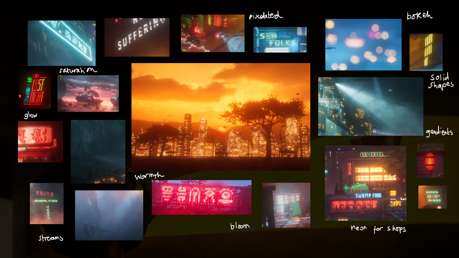
Producing moodboards for how I should approach lighting and shading was really imperative as it was focal in The Last Night scene. Mainly, I looked to Blade Runner 2049 and the original The Last Night game jam demo for fantastic, dramatic neon lighting in an urban environment.
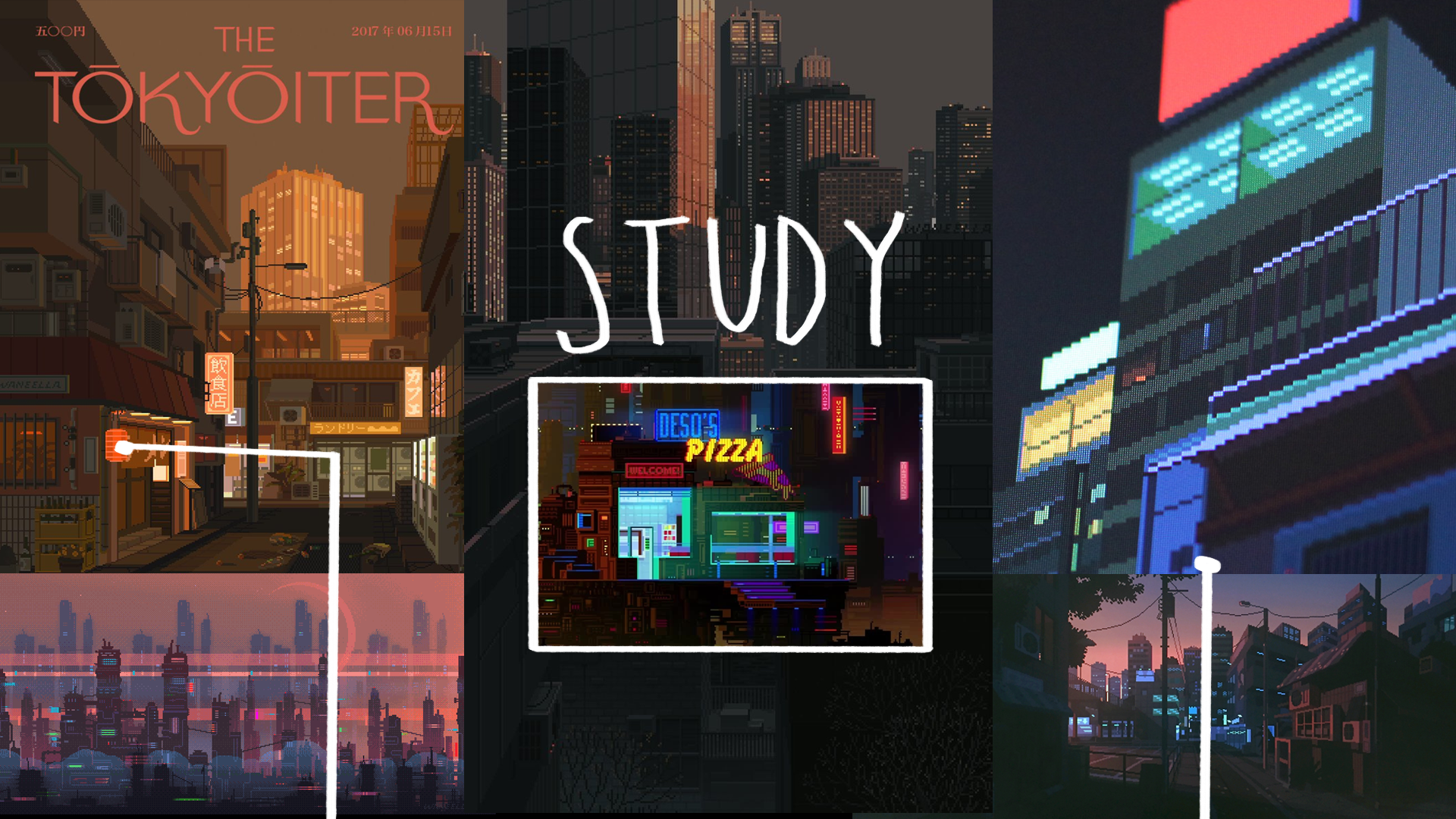
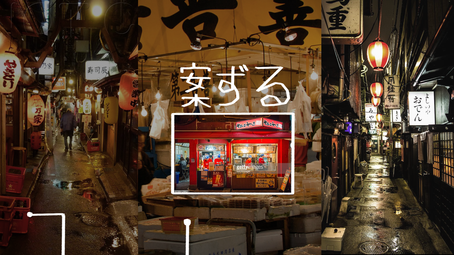
Lastly, I compared and studied light and colour in pixel art versus lighting in photographs of Japanese settings to decide how I should shade the space; these boards influenced my colour choices when texturing and choosing shades of light for the scene as well.

Conclusion
This first scene focuses on matching the reference clip as close as possible; the camera is fixed, the drone bobs up and down, and I tried to match the placement of props exactly.
+ I absolutely adore the lighting in the yellow windows with the orange god rays, as I matched the reference so closely! I also like how I modelled the exaggerated pixelated shapes such as as the white electrical boxes and the clothing on the washing line.
- I wish I could have animated both the camera and drone with more dramatic movements like the clip; I think that the textures needed may more variation in colour, especially the bin bag and crates that are close to the camera; lastly, the shine on the ground where the light hits the water is non existent in my scene.
This second scene is not a recreation; I started to experiment with a new camera placement, a water shader, a new lighting setup and a controllable character so to better navigate the environment.
+ The water reflection is my favourite part of this scene; it reflects the light from the drone, the car and restaurant beautifully and sets the scene. It would be this environment that I take further, with minor influences from the first; this is because I like how it is influenced by The Last Night, but takes more of innovative spin, that feels like my own, with the camera position and shaders. I would want to continue this with the suggestions in the improvements part.
- Ideally, I want to work out how to blueprint the camera so it rotates around the setting at triggered points, as well as reroute the controls for the player. This is so I can create a setting at the back of the restaurant and the player could run around the back of the space too, so it's like a little, proper environment. This environment feels much more like a 'concept' rather than a finished product at the moment.
This project helped me become more comfortable in Unreal, and taught me a lot of lessons when it comes to lighting, texturing and camera angles. I love that I stepped out of my comfort zone to create this and I see myself returning to this concept piece to develop it into a little pixelated diorama!
Thank you for reading!