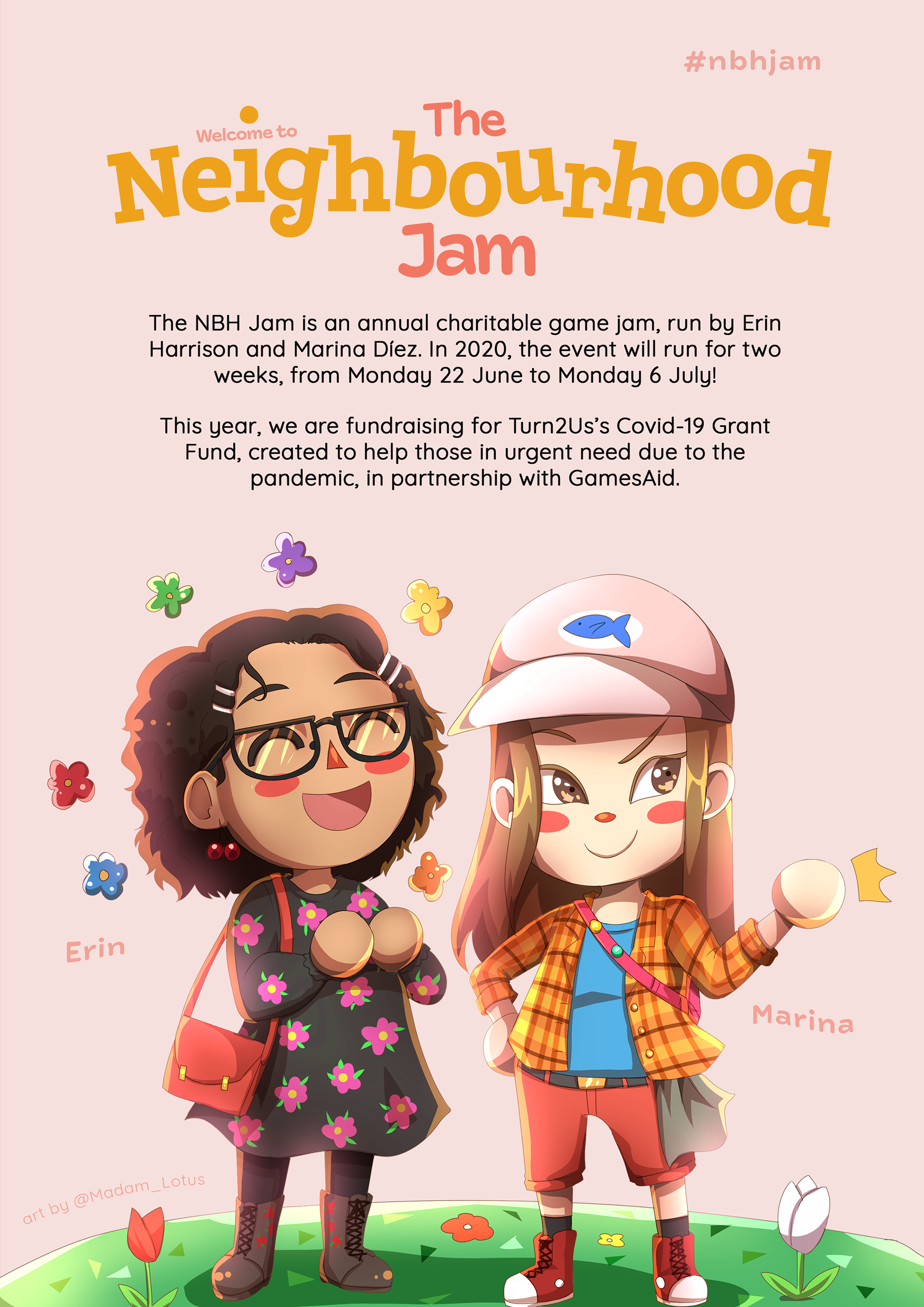
Marina and I co-organised 'The Neighbourhood Jam' from April to June 2020. My main task involved creating a clear brand image for participants and donators to connect to.
Inspiration
Animal Crossing
Marina suggested that since our name touched on community, our branding could be inspired by the wholesome game, Animal Crossing, especially since it's a title that is abuzz on social media - which in turn could help develop traction and interest in the fundraiser if we align ourselves with their aesthetic.
Design
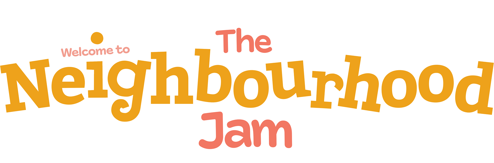
Logo
I created our logo by recreating the AC typeface in Photoshop, using the original font and Bitter, designed by Sol Matasto. Bitter is a bold serif with a regular weight, height and width, and a low contrast - all elements that match the Animal Crossing typeface. This meant, I could fill in any missing letters I needed.
I also used Farm New, a rounded sans serif, as a secondary typeface; I wanted only 'Neighbourhood' to carry the primary typeface and to be the central focus of the design.
I wanted to have a summery theme, so 'popsicle' colours like the fruity yellow and pink are heavily featured.
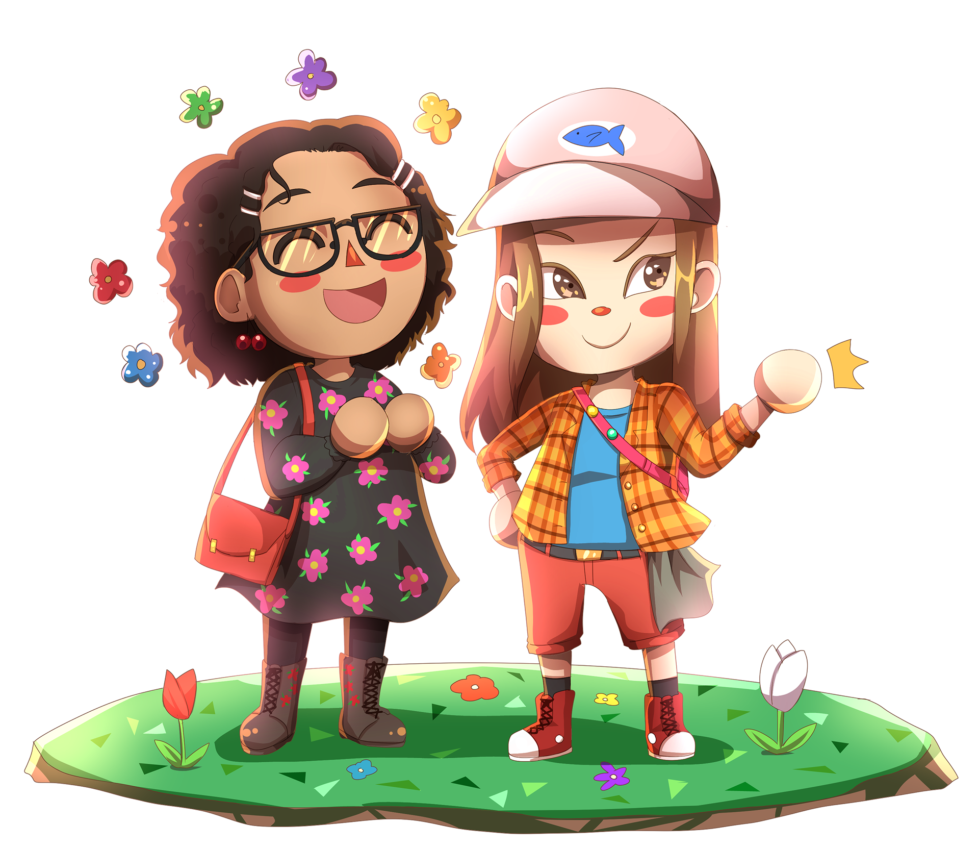
Art commission
Marina & I as AC Characters
To pull the press document together, and introduce ourselves to The Neighbourhood Jam participants, I commissioned Shanna Rodriguez Ortiz to draw myself and Marina as Animal Crossing characters.
My only request was for us to have the same characteristics as the human villagers, such as the face design, and our poses, and to use a summery colour palette.
Format & Copy
Press document
The colours I used for the sub-headers are pulled from the commission art. Additionally, I endeavoured to make the copy clear, informative and engaging!